UX Design for Startups: How to Build Products Users Love

People don’t choose products blindly; they pick the ones that look and feel right. A difficult-to-follow interface, friction, and outdated design are all it takes for a potential user to bounce.
That’s why user experience can’t be something you save for later. UX design for startups that are trying to earn trust and build traction is just as important as your pitch deck or marketing strategy.
But the reality is that most startups don’t have the time, team, or budget to obsess over UX sketching the way big companies do.
This blog isn’t here to give you textbook advice. It’s built for lean teams who need to make every pixel and interaction count. You’ll get practical, startup-ready ways to design experiences that increase on-page interactions and app downloads, without hiring a dozen designers or changing UX a hundred times.
Why UX means survival for startups
Researchers interviewed 16 professionals from two software startups. From the understanding of their practices, they found 14 UX-related needs that, if prioritised, could make their user experience better. These weren’t just minor improvements; they were user experience design gaps that caused confusion and drop-offs.
It’s a clear reminder that poor UX isn’t a rare case; it’s common, and it’s costly. For example, a rough user flow can lead to immediate drop-offs, especially in mobile-first markets. A frictionless user experience is not just a luxury; it’s critical for startup survival.
Helpful tidbit: In UX design, this is often known as a high cognitive load, where the user has to think too much or make too many decisions to complete a task.
As startups grow, they rely on usage data and analytics to improve UX. But numbers don’t always show why users get confused or drop off. Tools like Intellsys.ai help fill in the gaps by showing patterns in user behaviour, giving teams clearer insights into what needs fixing and why.
Lean UX for startup teams
The idea behind lean UX is that unless you’re an experienced corporation with veteran designers, you will have to adapt to the build-measure-learn loop. Hacks like using deliverables that top designers use or saving on free tools instead of buying stacks win in lean UX. Lean UX is ideal for early-stage UX design; it eliminates complexity and gets you feedback faster.
What lean UX looks like
In a university-led study, researchers applied Lean UX to improve a product built by a small team. Initially, users reported several issues: text that was hard to read, unclear steps during registration, and confusion around how to upload profile photos. Instead of writing long spec docs or planning a full redesign, the team used the Lean UX method to respond quickly.
This is what lean UX for startups looks like: Don’t wait for perfect clarity before taking action. If users are struggling with basic tasks, focus on one thing at a time:
Fix the friction > test the solution > repeat
You don’t need to solve everything at once. Often, small changes, like clearer instructions or better visual hierarchy, can improve user experience by a mile.
Lean UX is about solving real problems in real time. It gives you a framework to learn quickly from your users and make fast, focused improvements without slowing your team down.
Benefits of 7 UX principles for startups: Morville’s Honeycomb model
The pioneer for UX design and information architecture, Peter Morville, designed a UX Honeycomb. This isn’t an academic theory; it’s a checklist for how people experience your product.
The UX honeycomb shows why UX design strategy is important; it aligns usability with business goals. For startups, it’s also a map for building trust, usability, and long-term value without overcomplicating the process.
Let’s break the 7 principles of UX down with startup-specific context and examples.
1. Useful - Focus on solving a real problem
No matter how smooth or beautiful your product is, it won’t stick if it isn’t solving something real. Startups fall into the trap of building features they think are useful, instead of justifying the actual need. That’s why the first UX question for every feature isn’t “How should it look?” but “Does anyone need this at all?”
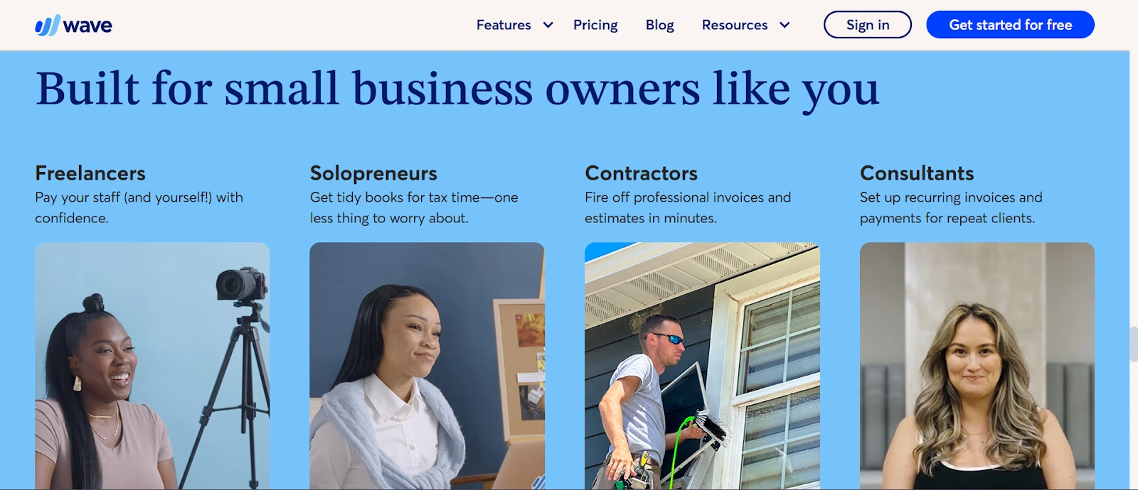
Wave, a free accounting tool for freelancers, focused only on the features solopreneurs actually use, like invoicing and receipt scanning, rather than trying to replicate enterprise tools.
2. Usable - Make it easy to get things done
Good usability means people can get things done without thinking too hard. This doesn’t mean dumbing things down. It’s about reducing unnecessary steps, clutter, or confusion. For a startup, high usability means fewer support tickets, better onboarding, and less friction.
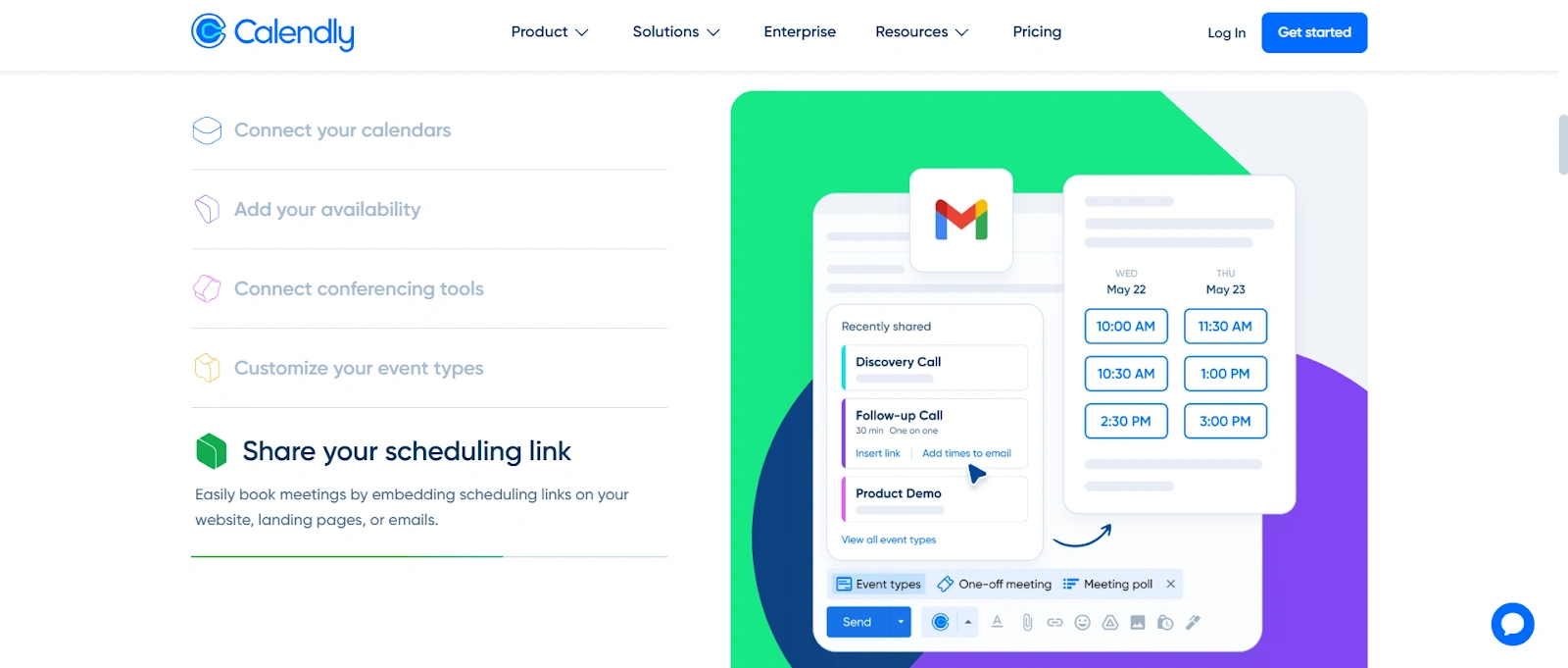
Calendly’s booking flow removes back-and-forth entirely. You share a link, they pick a time, done. No instructions needed, no learning curve.
3. Desirable - Design should feel intentional
Desirability is emotional. It’s how your product feels, whether it seems modern, trustworthy, delightful, or annoying. You don’t need to over-design, but a little attention to tone, motion, and visuals can make users want to come back.
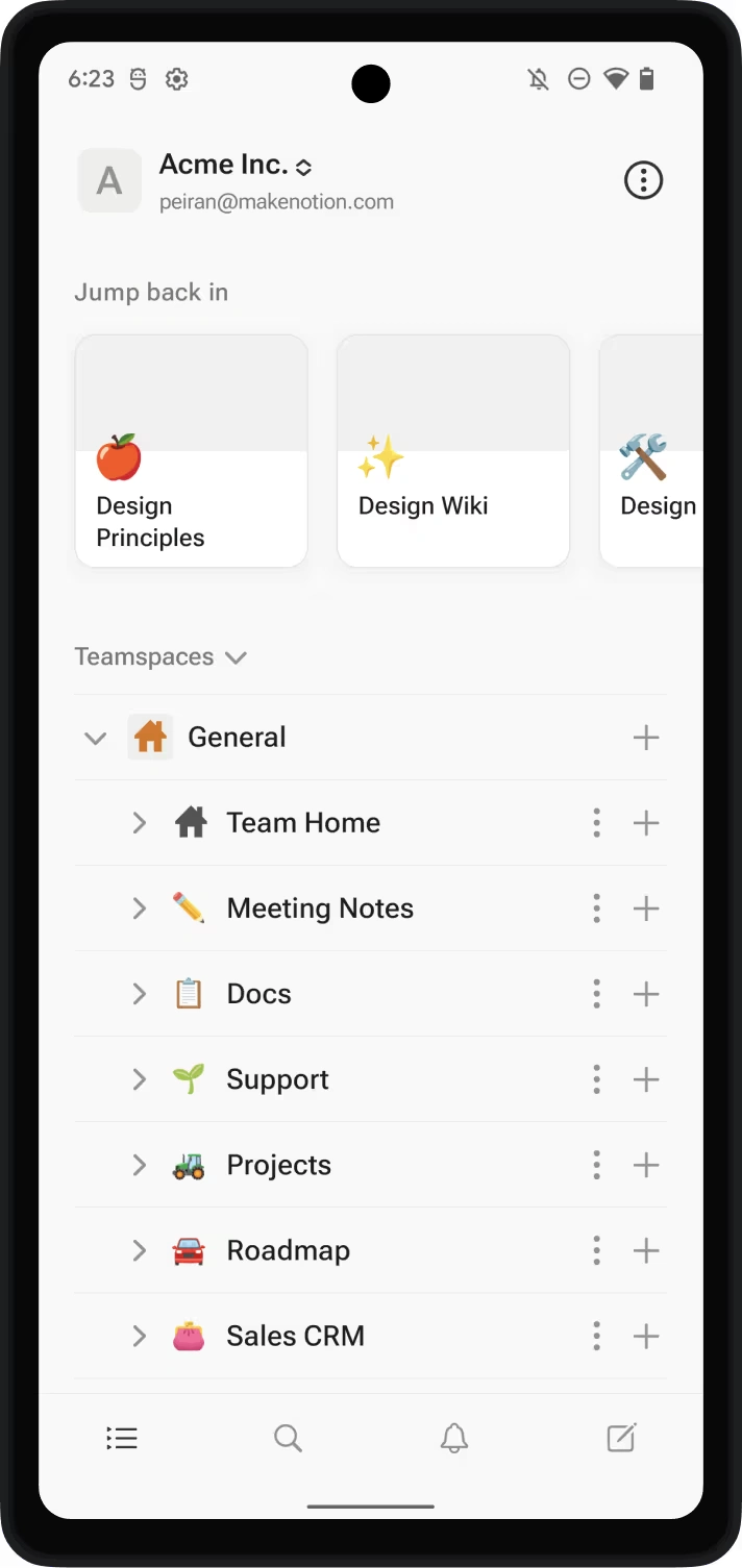
Notion adds soft animations, minimal aesthetics, easy shortcuts, and friendly tooltips that make a productivity app feel welcoming and not overwhelming.
4. Findable - Make information and features easy to locate
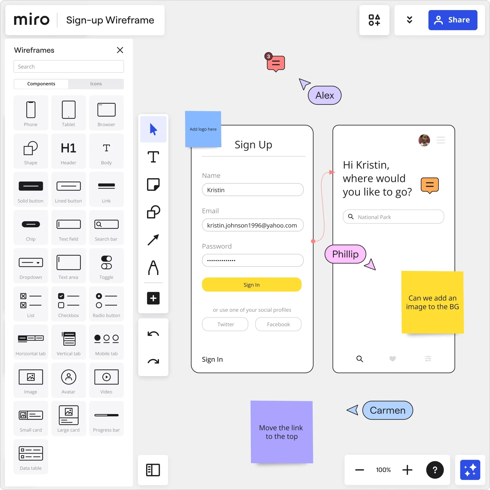
Your features might be great, but if users can’t find them when they need them, they don’t exist. A findable product has logical navigation, consistent labelling, and clear prioritisation. This is especially important when you frequently release new features.
Miro groups tools, keeps the collaborative interface uncluttered, and makes advanced tools accessible within a click or two, so beginners can habituate themselves fast.
5. Accessible - Don’t unintentionally shut users out
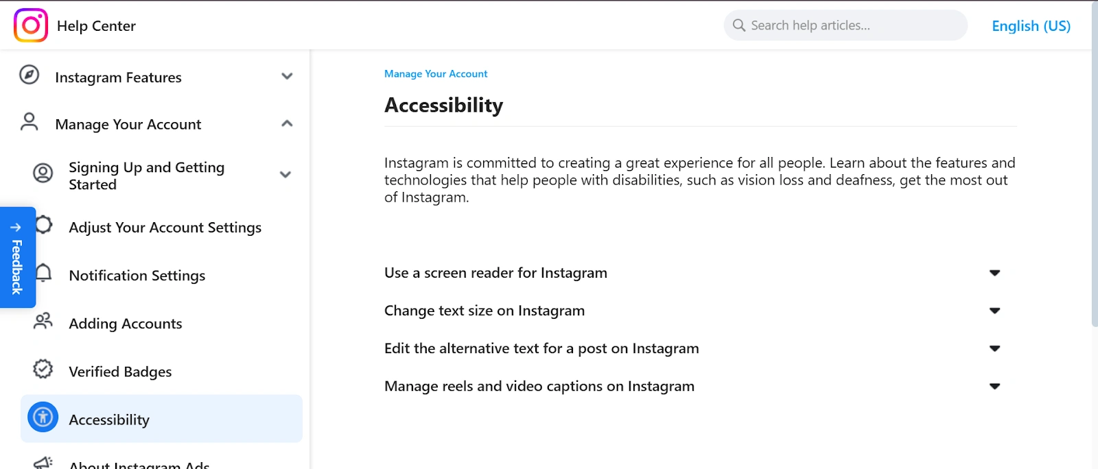
Universal design means designing for all users, including those with visual, hearing, or motor impairments. For startups, it’s easy to overlook, but accessibility features improve the experience for everyone.
Small choices like adding captions, alt text, and gesture support can go a long way, and it does not require additional investment if thought of from the get-go.
Instagram added custom alternative text and automatic alt text for photos, allowing visually impaired users using screen readers to understand what’s in an image. They also introduced auto-captioning for Stories and Reels, making content more accessible for those with hearing impairments or those who watch without sound.
6. Credible - Trust is designed, not declared
Startups don’t get second chances when something feels shady or broken. Credibility comes from consistency, transparent content, and frictionless performance. If something feels off, like a missing confirmation or unclear messaging, it creates doubt within the community.
TikTok was put on trial by the US Government, and India banned the use of the app in the country. Many users were sceptical, asking, “Is it secure?” The company has now redesigned its privacy settings with clearer controls, prominent labels, and educational prompts.
7. Valuable - Your UX should support business goals
Beyond being “nice”, a good user experience for startups should be about adding value to their users. Every part of your UX should push toward user goals (like completing a task or feeling in control) and business goals (like retention, conversion, or referrals).
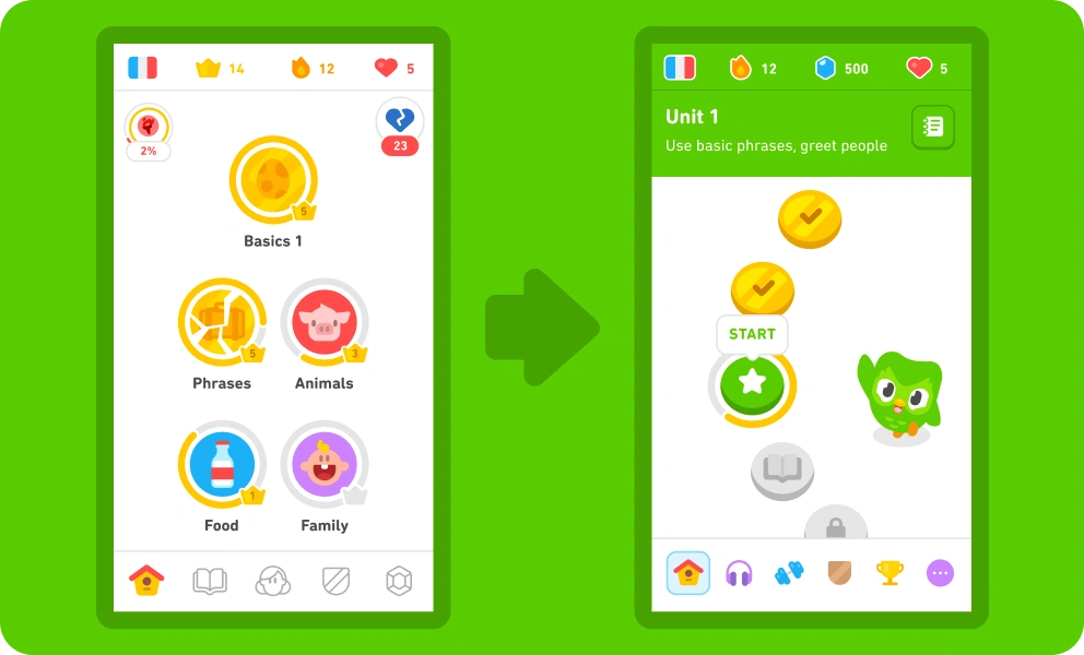
Duolingo’s streaks, reminders, and progress screens keep users coming back daily, which is exactly what adds to its growth and engagement metrics.
5 strategies and insights to apply UX design for startups
Balancing aesthetics and values doesn’t require a huge team or budget. It just takes smart choices, fast feedback, and a willingness to test before you perfect.
These strategies are designed to improve your early-stage UX design with limited resources:
1. Guerrilla user research
Quick, informal tests in coffee shops, coworking spaces, or even forums like Reddit or Slack help you identify pain points fast, without expensive labs. It’s called minimum viable research.
Use it to answer a specific question like:
-
Do users understand this form?
-
What’s the first thing they try to click on this page?
-
Can they describe what the product does in one sentence after using it?
-
Where do they hesitate or get stuck in the flow?
Pro tip: Keep it open-ended. Even five users can reveal 85% of usability problems.
2. Rapid prototyping and iteration
Prototyping and lean UX go hand in hand. Since the former has been a core part of startup culture for a long time, founders know not to spend too much time on perfecting a product before they test it.
Instead, use wireframes and low-fidelity prototypes to test user interactions early on. Then, continue the loop of fixing and testing.
3. Test early, test often
During a product launch, conduct lightweight A/B tests or one-question in-app polls after every sprint. This keeps your UX in sync with what users actually want.
Use Intellsys.ai to track which variation brings in better engagement, then dig into the “why” using combined click rate and behaviour data.
4. Friction-free onboarding
The faster users see the value, the more likely they are to stick around. Good onboarding doesn’t overload; it guides. You don’t need fancy animations or a full walkthrough, either.
Here are some startup-friendly user experience design tricks:
-
Start with the smallest win: Ask yourself, “What’s the first meaningful action a user should complete?” That’s your solution: get them there fast.
-
Use micro-copy to guide users: A short sentence like “You can always edit this later” can reduce anxiety during signup or setup.
-
Pre-fill anything you can: If the user already entered their name during signup, don’t ask for it again.
-
Add real-time feedback: Show a green checkmark when a password is strong or flag a missing field instantly. Don’t wait until they hit “Submit”.
Some suggestions for the future:
| Tactic | Meaning (What it does) | How to apply it |
|---|---|---|
| Progressive hints | Reveals info gradually instead of all at once to avoid overwhelming users. Often used during onboarding or setup flows. | Add brief tooltips or labels that appear when needed, not all at once. |
| Smart defaults | Automatically selects the most likely option for the user, reducing effort and decision fatigue. | For example, auto-select their country based on IP, or default to the most used setting. |
| Contextual empty states | Instead of showing a blank page, show guidance, examples, or a CTA that nudges the user to take the next step. | If a dashboard is empty, show “Add your first project” with a short explainer and button. |
| Progress tracking | Shows users how far they are in a process, helping reduce anxiety and encouraging completion. | Use a simple progress bar, checklist, or stepper in onboarding flows. |
5. Traction-first UX loop
Tie UX design decisions directly to a business metric, like first‑week retention or feature usage. Every prototype, test, and UI tweak should drive that metric forward.
Free and low-cost UX design tools for startups
Startups don't have to invest heavily in expensive UX tools. Here’s a list of free and affordable UX tools to get started:
| Tool | What’s it for | How startups can use it |
|---|---|---|
| Intellsys.ai | Behaviour tracking + sentiment insights | Combine click data with emotional patterns to see what’s wrong and why |
| Figma | Collaborative UI/UX design | Design wireframes and prototypes with your devs, PMs, or co-founders, all in one workspace |
| Maze (Free Trial) | Remote user testing and product surveys | Validate prototypes with real users online. Great for guerrilla-style feedback loops |
| Uizard (Free tier) | Quick, low-fidelity prototyping | Drag-and-drop interface to turn ideas into testable mockups, even without design skills |
| Adobe Express | Entry-level prototyping + simple animations | Ideal for teams that want fast visuals without the Adobe Creative Cloud price tag |
Hot tip: Ever thought of an incubator?
Startup Incubators like GrowthJockey can take a lot off your plate, from UX and testing to marketing, hiring, and fundraising. If you’re building lean, having a partner who’s been through the chaos makes everything faster and less of a guesswork.
4 UX design trends for startups to ride in 2025
Every year, users prefer a better and smoother way to use technology. From trusting AI content disclosures to prioritising empathy over algorithms, UX has seen it all. Take a look at what 2025 has in store for UX trends:
1. Modular dashboards
Static layouts are out. Startups are shifting to modular dashboards: bento-style grids that let users customise what they see. It makes your product feel personal and interactive without complex backend changes.
2. Low-light modes
The launch of dark mode was revolutionary. As users work late or switch between apps, offering a low-light option reduces eye strain and adds style. It’s ergonomic and aesthetic.
3. Kinetic typography
Subtle text motion, like slide-ins or pulses, does more than please the eye. It draws attention to key info and makes onboarding screens feel smoother and more intuitive.
4. AI-driven personalisation
Almost every design tool is getting on the trend of AI assistants (Canva’s AI visualises ideas, writes copies, etc). With basic user data, even small teams can personalise layouts, preferences, and prompts to match individual user behaviour in real time.
Common pitfalls that startups should avoid in UX
No matter how smart the team or how solid the idea, early-stage startups often fall into the same UX design traps. These mistakes can slow down growth, frustrate users, and waste valuable dev hours. Here’s what to avoid, and why it matters:
-
Over-engineering designs before validating them: If users don’t need it or don’t understand it, it doesn’t matter how refined it is. Start hazy, validate fast, and only then invest in polish.
-
Skipping mobile-first testing: Many founders design on desktop, but most users engage on mobile. Always test mobile versions first, not as an afterthought.
-
Focusing too much on aesthetics and neglecting user needs: A sleek interface might get compliments, but it won’t keep users if it’s confusing. UX is about clarity and usefulness; every design choice solves a problem, not just looks good in a portfolio.
Summing up: Why UX is your startup’s secret weapon
For startup companies looking for UX/UI designers, this guide offers practical steps to start before hiring. The product designs that win are the ones that are easiest to use, quickest to understand, and most aligned with real user needs.
You don’t just build a product, you build trust, traction, and loyalty by applying UX design for startups that’s lean and user-led, you can ship better, faster.
Keep testing. Keep iterating. And most importantly, stay close to your users; they’ll tell you everything you need to know.
Need help figuring out why users drop off, not just where, with all your data in one place? Tools like Intellsys.ai help startups connect behaviour data with actual user insight, so your next UX fix is an overall calculated decision.
FAQs on UX design for startups
1. What is the UX design process for startups?
The UX design process for startups usually follows a lean model: define the problem, research user needs, sketch quick prototypes, test with real users, and iterate fast. It focuses on speed, feedback, and alignment with business goals, not perfection.
2. What is the first rule of UX design?
The first rule of UX design is: design for the user, not yourself. Your product should solve real problems clearly and simply. It’s not about what looks impressive, it’s about what feels intuitive and useful to your actual users.
3. What is UX design for beginners?
UX design for beginners, or user experience UX design, is about creating smooth, helpful digital journeys. It includes understanding user behaviour, designing clear interfaces, and constantly testing ideas, starting with sketches and feedback, not full-blown designs.
4. How to start a UX project from scratch?
Start by defining the problem you’re solving. Then talk to users, sketch basic flows, and build a low-fidelity prototype. Test it quickly, gather feedback, and improve. Don’t wait to be “ready”. Good UX happens through doing, not overplanning.