Marketing Dashboards Guide: Benefits, Types & Popular Platforms for 2025

How often does your marketing team check Google Analytics? In fact, how many different marketing tools does your team check daily?
Google Ads here, Instagram insights there, email metrics somewhere else. By the time you compile everything into a spreadsheet, the data's already outdated.
This fragmentation costs the average marketing team hours per week. Just think about it, you can spend that time optimising campaigns. A well-built marketing dashboard solves this chaos by pulling all your metrics into one real-time view.
Whether you're tracking digital marketing dashboard KPIs or monitoring campaign ROI, the right dashboard transforms how quickly you spot opportunities and fix problems.
We will show you exactly how to build, customise, and maintain your analytics dashboard that can actually drive business decisions.
What is a Marketing Dashboard?
Let’s get to the definition. A marketing dashboard is a visual interface that displays your most important marketing metrics and KPIs in real-time, pulling data from multiple sources into a single, actionable view.
Unlike static reports that show historical snapshots monthly or quarterly, automation dashboards update continuously. And unlike scorecards that track just a few top-level KPIs, dashboards provide comprehensive visibility across channels, campaigns, and customer journeys.
Think of it this way: reports tell you what happened last month, scorecards show if you're winning or losing, but dashboards reveal what's happening right now and why.
5 benefits of using marketing dashboards
Data analytics dashboards cut the time from question → answer → action by putting live KPIs in one place. You’ll feel it day-to-day: fewer “which number is right?” debates, less copy-paste work, and faster budget or creative moves when performance shifts.
1. Faster time-to-insight: A study on Microsoft Power BI[1] found organisations saved ~125 hours per BI user per year thanks to self-service reporting and reduced central team effort.
2. Shared visibility = smoother alignment: Centralising data makes it easier for decision-makers to discuss organisational and customer data, cutting back-and-forth and helping teams act on the same truth.
3. Less tool-switching: Your team will save hundreds of hours every year from streamlined data prep and access.
4. Quicker operational decisions: You spot a weak ad set or geo, shift budget, and verify the impact faster because the numbers are already connected.
5. Fewer “version-of-truth” fights: Central dashboards replace conflicting slide decks with governed metrics and live filters, which studies associate with higher productivity and reduced rework across business users.
Types of marketing dashboards
Different roles need different views of marketing performance. Here's how successful teams structure their dashboard marketing digital setup:
Leadership/CMO dashboards focus on business impact: revenue attribution, marketing efficiency ratio (MER), customer acquisition cost versus lifetime value, and forecast versus actual performance. These dashboards answer board-level questions about marketing ROI and growth trajectory.
Performance/growth dashboards dive into channel efficiency: ROAS and CAC broken down by channel and geography, creative cohort performance, and budget pacing. Growth marketers live in these views, constantly optimising spend allocation.
Lifecycle/CRM dashboards track the customer journey: signup to activation rates, retention cohorts, and churn patterns. These help identify where customers drop off and which segments deliver the highest value.
Content/SEO dashboards monitor organic performance: branded versus non-branded clicks, ranking distributions across position buckets, and share of voice against competitors. Content teams use these to prioritise efforts and demonstrate impact.
Paid media dashboards provide campaign-level detail: spend, CPC, CPM, click-through rates, conversion rates, and cost per acquisition across networks. Media buyers need this granularity for daily optimisation.
Social/brand dashboards measure engagement: reach, interaction rates, and influencer performance. Brand managers track sentiment and community growth through these specialised views.
Top 10 marketing dashboard platforms in 2025
The best dashboard tools depend on your team’s skills, data complexity, and budget. Here’s how the leaders compare right now and what they actually do well (and where they don’t).
1. Google Looker Studio (Free) / Looker Studio Pro
Google’s free dashboard layer gives you native connectors to Google products (GA4, Google Ads, Search Console) and a vast Community Connectors ecosystem for everything else.

The public template/gallery makes getting started fast, and shareable links keep distribution simple.
Pros:
- Free to start
- Works really well with Google stuff (GA4, Google Ads)
- Lots of ready-made templates
- Easy to share with a link
Cons:
- Not great for very tricky/huge data
- Can get slow if you mix many data sources
- Some add-ons can be hit-or-miss
2. Intellsys.ai (AI Copilot for Growth Marketing)
India-centric AI copilot by GrowthJockey, the platform can auto-generate dashboards/ reports with 200+ integrations and guided onboarding.
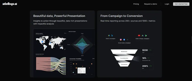
Intellsys can also strategise for you instead of simply providing a dashboard to analyse. Moreover, with the help of AI you can build beautiful and powerful presentations in no time.
Pros:
- The AI helps build dashboards for you
- Guided setup is beginner-friendly
- Can auto-email/share reports; India-friendly plans
Cons:
- Newer tool
3. Databox
Built for marketers, Databox ships hundreds of ready templates and a goal/alerts system so teams can set targets, monitor progress, and get Slack or email pings when KPIs change.
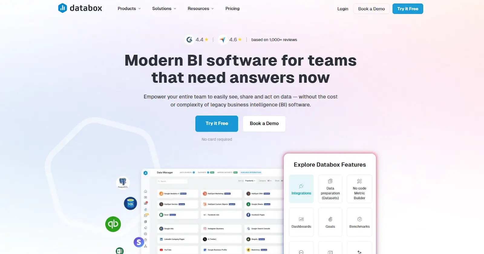
Plus, a solid mobile app for on-the-go checks. Setup really can be minutes if you start from a template.
Pros:
- Set up in minutes with templates
- Can set goals and get alerts when things change
- Handy phone app to check numbers anywhere
Cons:
- Not built for fancy data math
- Gets more expensive as you need more features
Check our comparison of Intellsys vs. Databox and see which one is better
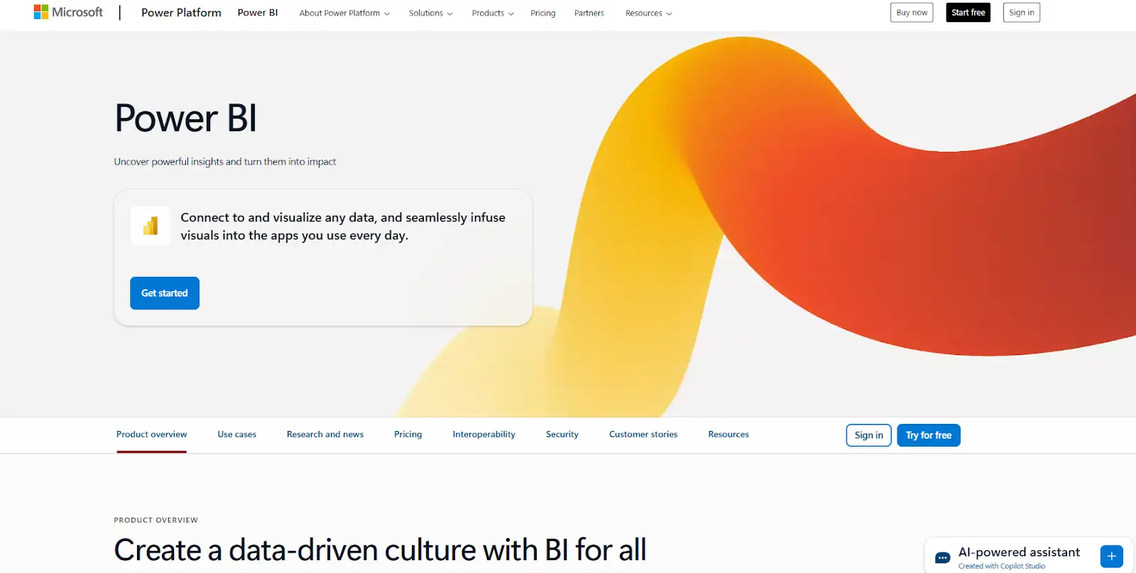
4. Microsoft Power BI
Enterprise-grade analytics with the DAX modeling language and strong governance. It works well for those who are already inside the Microsoft stacks. Sharing typically requires Pro/PPU licenses (or Premium/Fabric capacity for broader access).
Pros:
- Super strong for tricky calculations
- Good for big teams and strict rules
- Works nicely with Microsoft tools
Cons:
- Takes time to learn
- You need the right licenses to share widely
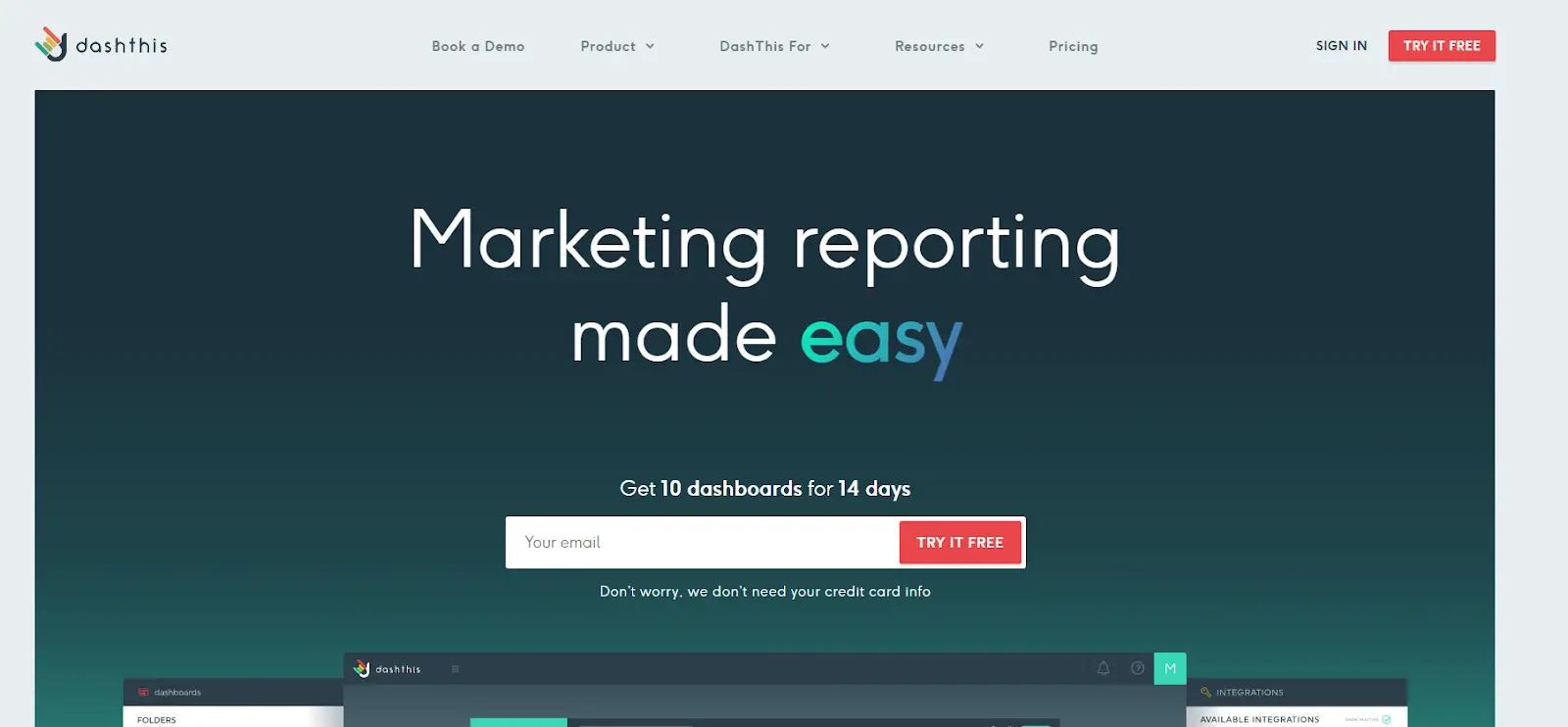
5. DashThis
DashThis uses a “pay per dashboard” model, with unlimited users across plans. It is great for agencies sending automated client reports and PDFs on a schedule, plus white-label options. It’s about standardised reporting speed, not deep analysis.
Pros:
- Super fast for client-ready reports
- Unlimited people can view/edit
- Can auto-send reports and use your own branding
Cons:
- Not for deep, detective-style analysis
- You can’t change the raw data much
6. Tableau
A visual analytics leader with Accelerators (ready dashboards, including marketing) and Tableau Cloud for distribution. The data analytics dashboard has good interactivity for exploration and storytelling.
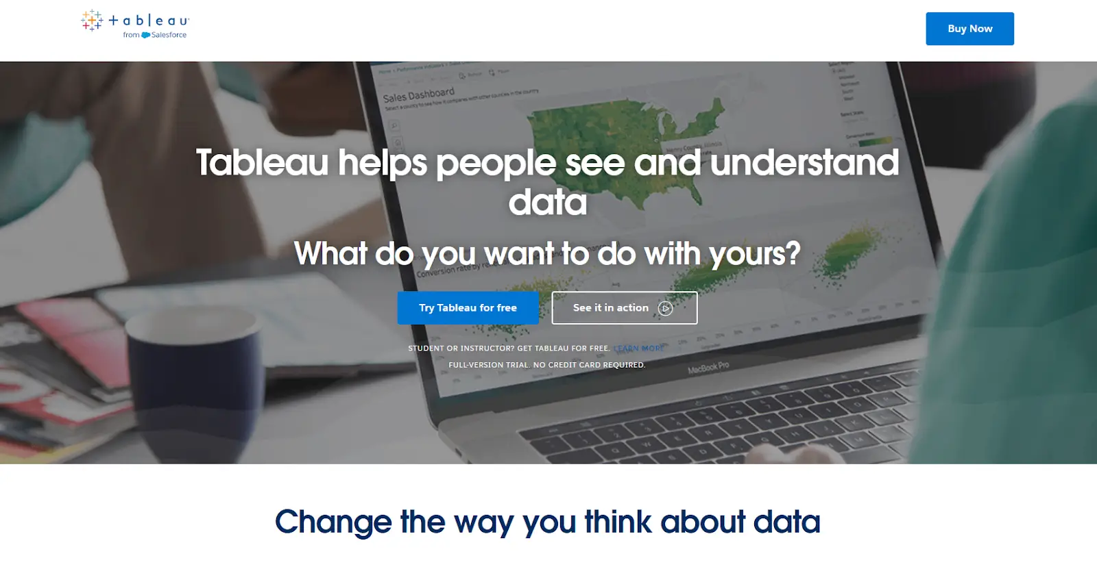
Pros:
- Beautiful, super interactive charts
- Ready-made “Accelerators” help you start fast
Cons:
- Needs a skilled user to build
- Can be pricey for teams
7. Zoho Analytics
A full BI suite with Ask Zia (natural-language Q&A, automated insights, anomaly alerts) and 500+ connectors; fits brilliantly if you’re in the Zoho ecosystem.
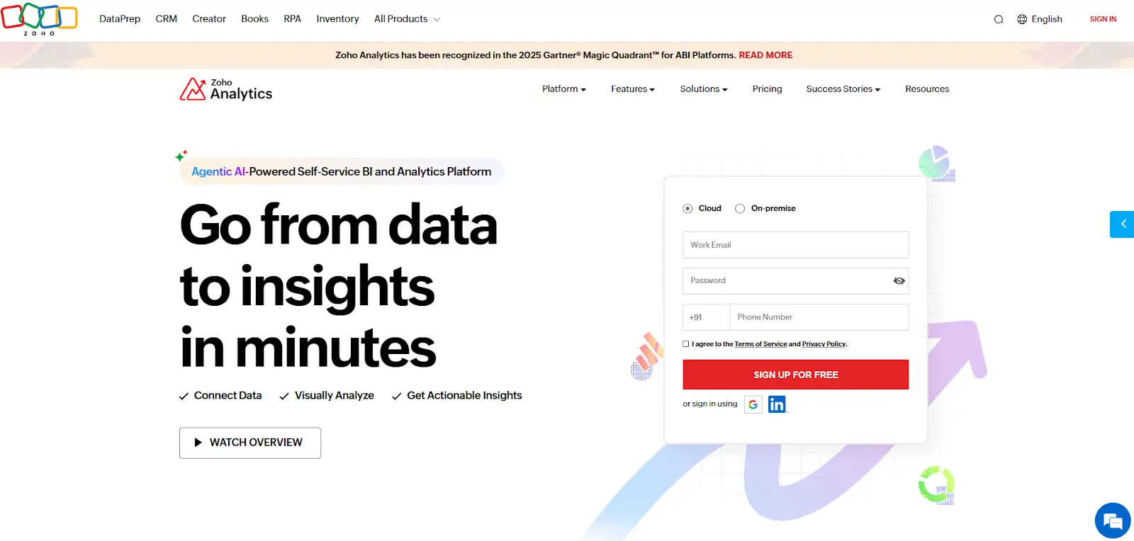
Pros:
- You can ask questions in plain English (Ask Zia)
- Tons of connectors
- Easy to embed dashboards in other apps/sites
Cons:
- Heavier tool-best if you already prep your data or use Zoho
- Might feel overkill for simple reporting
8. Whatagraph
A cross-channel reporting platform with live-link dashboards (viewers can open, filter, and change dates in-browser) and custom calculations. You will also find blended metrics to standardise KPIs across sources.
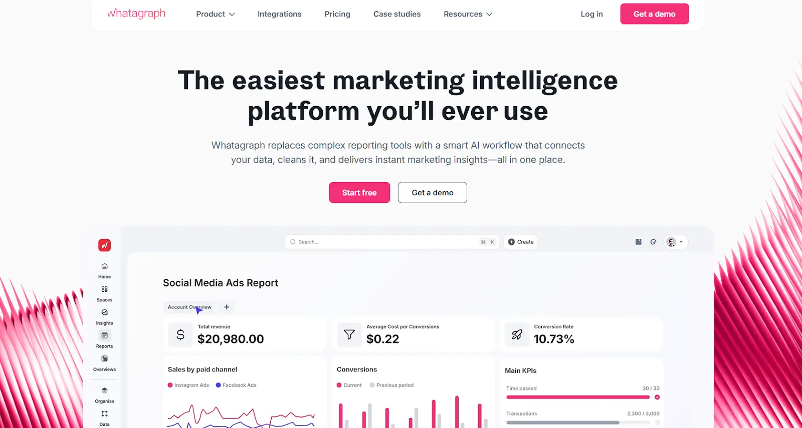
Pros:
- Share live dashboards with a simple link
- Make your own formulas across channels
- Good library of templates
Cons:
- Price depends on plan/usage
- Very advanced modeling is better in a BI tool
9. Klipfolio (Klips & PowerMetrics)
A long-standing dashboard tool with PowerMetrics - a centralised, reusable metric catalog - alongside traditional Klips. It ships curated marketing templates and an examples gallery to accelerate builds while keeping metric definitions consistent.
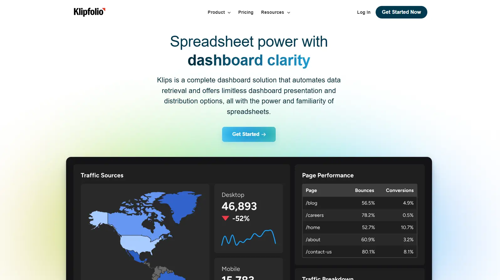
Pros:
- Keeps one clear definition for each metric
- Lots of templates and examples
- Good for live, always-on dashboards
Cons:
- Big builds can take time
- Features are split across two parts (Klips + PowerMetrics)
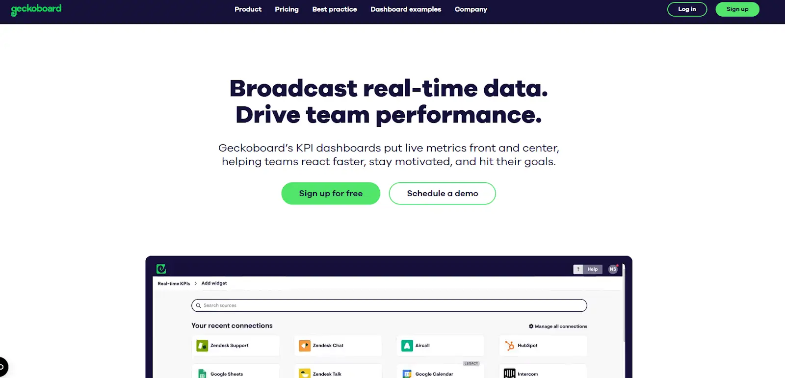
10. Geckoboard
Purpose-built for real-time TV dashboards and wallboards. It can connect to 90+ native data sources, then auto-send email or Slack snapshots or display on TVs via the “Send to TV” feature and loops. Ideal for at-a-glance KPI visibility across teams.
Pros:
- Perfect for big TV screens in the office
- Can auto-send snapshots to Slack or email
- Connects to lots of tools quickly
Cons:
- Not meant for complex data modeling
- Refresh speed depends on the data source
Common mistakes while looking at your marketing dashboard
Even the best data analytics dashboard becomes useless if you're interpreting it incorrectly. The most dangerous mistake? Obsessing over unnecessary metrics while ignoring business drivers.
Teams often make these critical errors:
- Comparing incompatible timeframes - Viewing last week against last month without accounting for seasonality or campaign changes
- Ignoring statistical significance - Making decisions based on tiny sample sizes or normal fluctuations
- Missing the context - Celebrating increased traffic while conversion rates plummet
- Over-aggregating data - Hiding important segment-level insights in company-wide averages
- Neglecting attribution models - Giving all credit to last-click when multiple touchpoints contributed
- Forgetting external factors - Not accounting for competitor actions, market changes, or seasonal patterns
Always ask "why" when metrics change, verify patterns across multiple time periods, and connect every metric back to business outcomes. Your company dashboard should drive decisions, not just display data.
Get started with an AI-first marketing dashboard for your business
A great marketing dashboard is about faster and smarter decisions. When your digital marketing dashboard pulls GA4, Google Ads, SEO, email, and revenue into one analytics dashboard, you cut the time from question to action to minutes.
Pick the best dashboard for your team’s skills and data. intellsys.ai from GrowthJockey is one of the best upcoming AI-powered platforms that can keep you a step ahead.
Get started with your 30-day free trial today!
FAQs on Marketing Dashboards
What is a marketing dashboard?
A marketing dashboard is a live, visual home for your most important KPIs, combining data from multiple tools (ads, analytics, CRM, commerce) so you can see performance at a glance.
What should a dashboard for digital marketing include?
Start with KPI dashboard examples like Revenue, MER/ROAS, CAC, LTV/Payback, then add channel tiles: a Google Ads dashboard (spend, CTR, CPC, conversions), an SEO dashboard (rank buckets, clicks, CTR), and lifecycle metrics (sign-ups, retention).
Which tool is best for a marketing dashboard?
There’s no single “best dashboard.” For fast, free builds use Looker Studio; for AI-assisted analysis consider Intellsys; for enterprise modelling choose Power BI or Tableau. Match the tool to your data complexity and team skills.
How often should I update a marketing analytics dashboard?
Daily for performance teams (spend, ROAS/CAC), weekly for leadership roll-ups, and monthly for cohort and LTV analysis. If a widget doesn’t influence a decision at that cadence, remove it, your marketing analytics examples should stay lean and actionable.